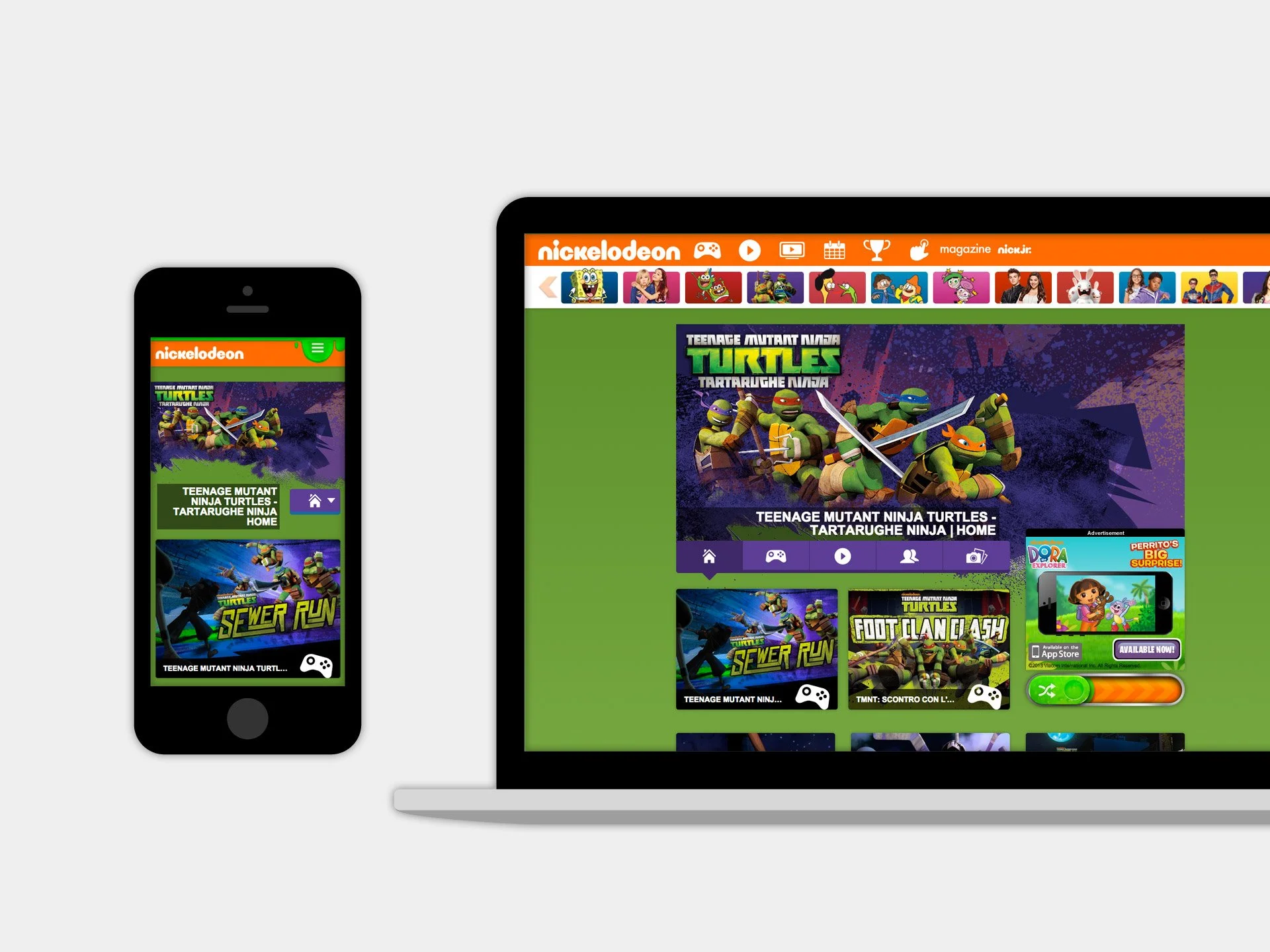


From horizontal to vertical scroll
The biggest challenge is to keep the consistent UI/UX experience with Nickelodeon branding and also technically following the regional specs. We adapt the app-like interface from nick.com and transfer it to language-localization friendly. Instead of the infinite scroll, we use a "More" button to link to a hub page considering the global users who have the slower Internet speed.

Supporting both current and new advertising requirement
Besides the current leaderboard (728x90) and rectangle (300x250) banners, a new 300x600 Rising Stars Ad unit is introduced. It locates at the same spot as 300x250 and expands up - this brings a design challenge to the property header art. The art should not be covered by 300x600 Ad but also look balanced with 300x250.

Customizable content
We give each Nickelodeon show a customized color theme by defining a set of CSS objects in CMS. These colors are reused on different elements across the show's sub pages. This solution provides not only the characteristic of each show but also the cohesion of Nickelodeon branding experience.
