My Purchases Redesign
Company: Coursera
Role: Product Design Lead
Project Year: 2015
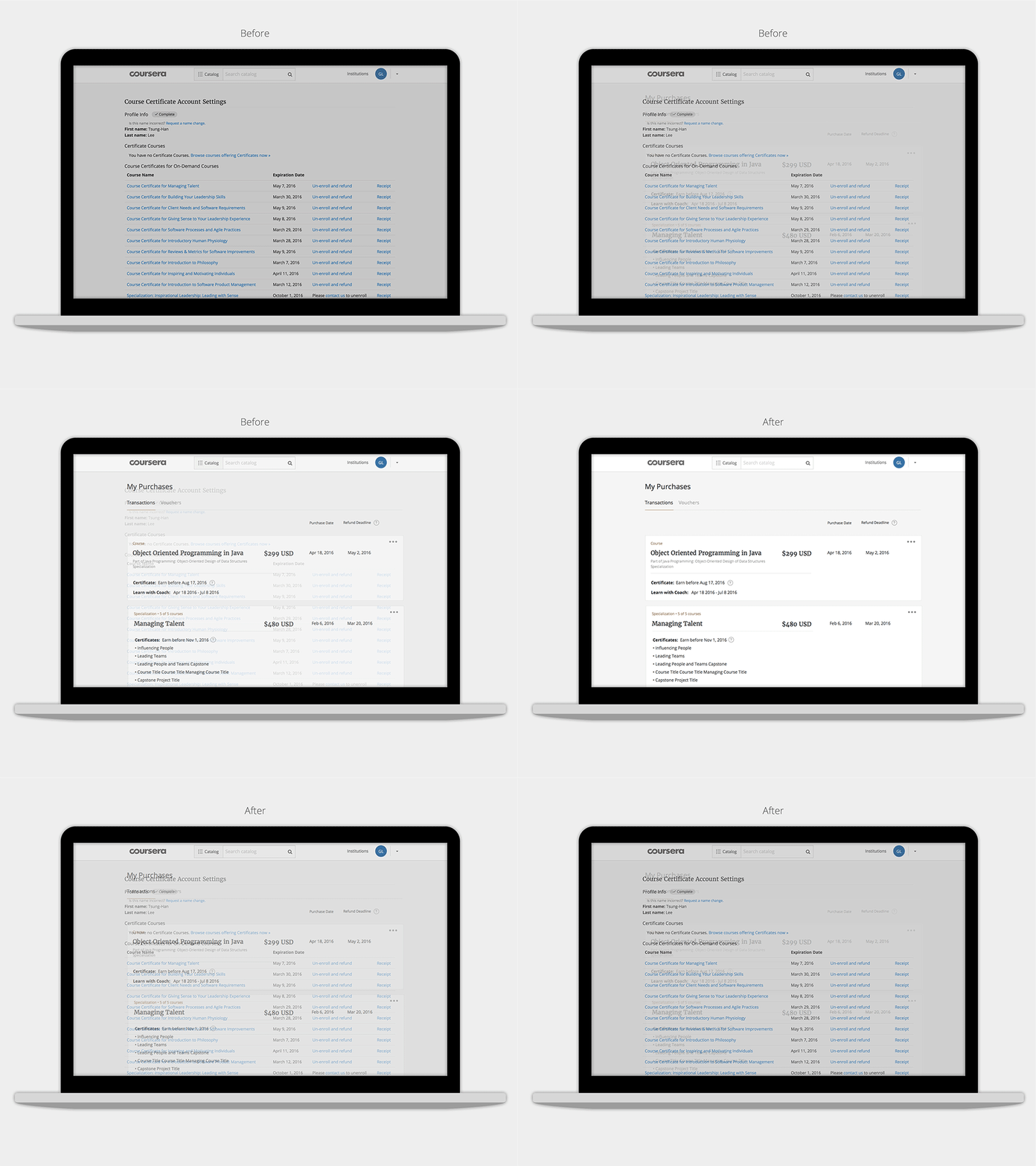
My Purchases is a page that allows learners to manage the products they own on Coursera. The first version was built in 2012 and initially named Course Certificate Account Settings. As Coursera grew rapidly and the product became much more complicated, the existing design no longer satisfied the sustainable business needs. Refunding has been one of the top learner pain points for a long time. A thorough surgery from inside out was desperately needed.
Before / After - My Purchases design
Observation
Payment-to-refund journey
To understand where the learner's pain points were, we sat down with Community Operations team to invest our learners tickets and mapped them out on the end-to-end payment-to-refund journey. Problems were quickly categorized into three buckets:
Pain points mapping
1. Policy issues
learners had difficulty understanding the full refund policy due to the complexity of the product. After discussing with legal and product leads, we decided not to tackle the policy issues this time and focused on UI/UX fix as we needed a short term solution for the upcoming product launch.
2. Communication issues
We also learned we failed to communicate about "Refund Deadline" and "Certificate Payment Expiration" sufficiently. The solution was to identify all broken scenes in the user journey and educated the learners by the right media in the right timing, e.g. adding refund deadline information and links in the receipt email as the mock below.
Before / After - receipt messaging
3. Functionality issues
This was mainly on My Purchases page and a combination of not providing the proper call-to-actions, lacking information transparency, and poor copywriting (see one example in the image below). One critical issue was the out-dated backend APIs couldn't provide sufficient data. After discussing with engineers, we decided to rewrite backend APIs to clean up the technical debt.
Before / After - the tooltips in the new design now explains why the refund is not available.
UI Challenges
1. Simplicity:
The concept behind the redesign was simple: receipts. Each card on this page represents a transaction. Following the nature of a receipt, the information to display on the UI were easily prioritized. "Amount Payment", "Refund Deadline" and "Purchase Date" were treated as the first-class citizen; everything else went into "Purchase Details".
2. Consistency
The visual language and usability patterns needed to be consistent with Coursera brand. We adapted the existing dropdown menu and card style to reduce the learning curve.
3. Compatibility
The redesign needed to support existing scenarios and all edge cases. To constantly trace user states and keep everyone in sync, I created a spreadsheet (see image below) to document the process. It not only served as a great communication channel between copywriters, engineers and designers, but also handful for dogfooding (QA) sections.
Copy states spreadsheet helped the team document all possible states and edge cases, also get the copy vetted by the copywriter quickly.
4. Scalability
We also needed this page ready for the upcoming product launches. The design should be flexible to display various information in different products.
Results
My Purchases was launched in January 2016. We are monitoring the data and expect to see a dropping rate on learner tickets regarding payment/refund issues. More details to come.
Call-to-actions are organized in one place. The dropdown is scalable for more potential functions (repurchase, archive... etc).

